気象科学と生物科学からのこのフォルダの二つのケーススタディは、QAD-アンケートと以下のレビュー論文(tigramiteのgithubチュートリアルフォルダを含む)のメソッド選択フローチャートに従います。
Runge, J., Gerhardus, A., Varando, G., Eyring, V. & Camps-Valls, G. Causal inference for time series. Nat. Rev. Earth Environ. 10, 2553 (2023).
選択したQADの問題を取り扱うソフトウエアのメソッドのリストは、レビュー論文の巻末にあります。
この例は、短波の放射線とグロスプライマリプロダクト(GPP)を含むデータから、エコシステムの呼吸の大気の温度の因果の影響を調査するために、因果推論を基礎にした技術を使って示します。ノンパラメトリック因果推定をよりよく説明するために、このケーススタディは、量的に正解データ(グランドツルース)として知られている合成システムを考えます。
これらの数式は、SCMとして解釈されます。ηtは、Tairを除いた 相互に独立した標準正規ノイズ項、ここで もっと高い温度を表現するためのcubic(立体の)階乗を伴うηtTair = ηt + 1/4 et3 (ηとεは標準正規ノイズ)。SCMは、実際のデータに現れる(論文参照)Recoと Tairの間の単一の様式の関係を表します。
分析は、最初に因果探索を説明し、その後、因果の影響を推定を説明します。tigramiteの因果推論パッケージと同様にPythonの標準パッケージをimportして始めましょう。
import numpy as np
import matplotlib.pyplot as plt
import matplotlib.transforms as mtransforms

import sys
from copy import deepcopy

import sklearn
from sklearn.linear_model import LinearRegression
from sklearn.neural_network import MLPRegressor
from sklearn.gaussian_process import GaussianProcessRegressor
from sklearn.ensemble import RandomForestRegressor
from sklearn.preprocessing import StandardScaler
from scipy.stats import gaussian_kde

import tigramite
import tigramite.data_processing as pp
import tigramite.plotting as tp

from tigramite.models import LinearMediation, Models
from tigramite.causal_effects import CausalEffects

from tigramite.pcmci import PCMCI
from tigramite.independence_tests.robust_parcorr import RobustParCorr
データ生成と図示
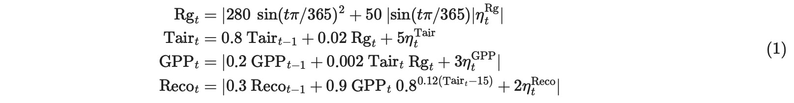
ステップは、密接にQAD-テンプレートに従います。(レビュー論文のTab1と フローチャートFig2)。気象の例とは反対なので、ここで全ての変数は日次の連続時系列としてすでに定義されています。次の疑問は、ステーショナリーデータセット(Fig.2フローチャート)生成についてです。気候の例とは異なって、ここで多重のデータセット(多重のサイト)の設定が、考慮されます。合成の例を考慮して、ステーショナリーは、サイトは同じSCMの異なる実現値として構築されることによって満たされます。したがって、異なるサイトの時系列は単純に合計されます。季節的な非ステーショナリーを緩和するために、4月から9月まで(モデルの月)の期間だけ、考慮します。(下の図を参照)
# Time series length is 6 years
T = 365*6 + 1

# 4 Variables
N = 4

# We model 5 measurement sites
M = 5

data_dict = {}
mask_dict = {}
for site in range(M):

    modeldata_mask = np.ones((T, N), dtype='int')
    for t in range(T):
        # April to September
        if 90 <= t % 365 <= 273:
            modeldata_mask[t,:] = 0

    mask_dict[site] = modeldata_mask

    modeldata = np.zeros((T,N))
    random_state = np.random.RandomState(site)
    noise = random_state.randn(T, N)
    noise[:, 1] += 0.25*random_state.randn(T)**3

    for t in range(1, T):
        modeldata[t,0] = np.abs(280.*np.abs(np.sin((t)*np.pi/365.))**2 + 50.*np.abs(np.sin(t*np.pi/365.))*noise[t,0])
        modeldata[t,1] = 0.8*modeldata[t-1,1] + 0.02*modeldata[t,0] + 5*noise[t,1]
        modeldata[t,2] = np.abs(0.2* modeldata[t-1, 2] + 0.002*modeldata[t,0] * modeldata[t,1] + 3*noise[t,2])
        modeldata[t,3] = np.abs(0.3*modeldata[t-1,3] + 0.9*modeldata[t,2] * 0.8**(0.12*(modeldata[t,1]-15)) + 2*noise[t,3])
    data_dict[site] = modeldata

# Variable names
var_names = ['Rg', 'Tair', 'GPP', 'Reco']

# Init Tigramite dataframe object
dataframe = pp.DataFrame(data=data_dict,
                    mask = mask_dict,
                    analysis_mode = 'multiple',
                    var_names=var_names)
fig_axes = tp.plot_timeseries(dataframe,
grey_masked_samples='data',
adjust_plot=False,
color = 'red',
alpha=0.6,
data_linewidth=0.3,
selected_dataset=0)
for index in range(1, len(data_dict)):
adjust_plot = False
if index == M - 1:
adjust_plot = True
color = ['red', 'green', 'blue', 'yellow', 'lightblue'][index]
tp.plot_timeseries(dataframe,
fig_axes =fig_axes,
grey_masked_samples='data',
adjust_plot=adjust_plot,
color=color,
time_label='day',
alpha=0.6,
data_linewidth=0.3,
selected_dataset=index)
plt.show()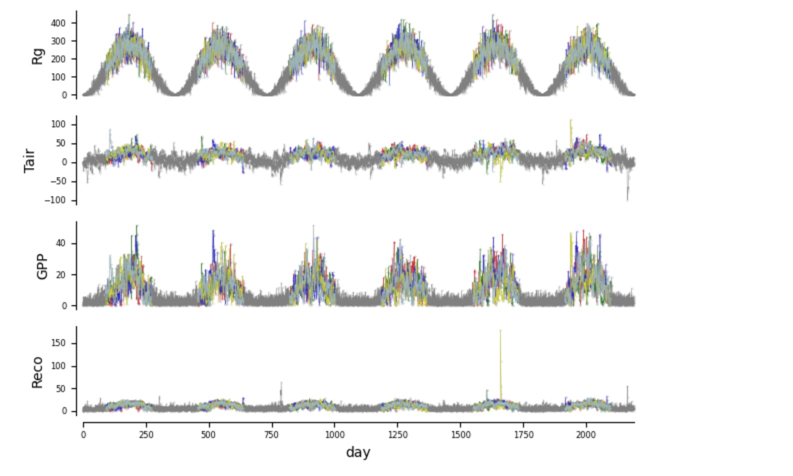
グレイのサンプルはマスクされています。非線形のために発生している極値に注意してください。
因果探索分析
このステーショナリーデータセットを与えることで、最初の因果の疑問は因果探索に関するものです。適当な因果探索メソッドを選択するために、妥当に作ることができる仮定を定義します。
ステーショナリー仮定、決定論、潜在confounder
ここのデータは、多重のデータセットからきます。(論文の図2にある因果探索フレームの青い箱)しかし、データセットは、同じ元になる分布を共有します。そして、次の疑問は、システムが決定論的か否かです。このスケールの動的な複雑性を与えることで、非決定論的なシステムになることを仮定することができます。次に作る仮定は、隠れたconfounderがあるかどうかです。それは、二つ以上の観測変数に因果的な影響を与える非観測の変数です。ここで、どのステーショナリーが予期されるか季節を横切って分析を制限するために、基礎となっているSCMでは真である、隠れたconfoundingの欠如を仮定することが妥当です。
構造上の仮定
グラフ種別の構造上の仮定は、作る必要があります。ここの過程は速いので、同時に発生する因果の影響は、(それは、1日のデータの時間リゾリューションの元での時間スケールの因果の影響)発生するかもしれません。さらに、ここでは、Rgが外因性であることを強制される専門知識は、グラフにどのようなRgの親を持つことも許されません。これらの仮定は、制約を基礎にした因果探索アルゴリズムPCMCI+を使うことを提案します。(または、図2の他の同様のオプション)
PCMCI+によって推定される因果時系列グラフの最大時間遅延の仮定を作るために、(それは、グラフの中にあるXt-τi -> Xtjのような全てのτの最大)
、データは、遅延した依存した機能、を調査するために使うことができます。または、ここで実行したように、τmax=1(日々の単位)を正当化するために使うことができます。
パラメトリック仮定
PCMCI+の次のハイパーパラメータの選択は、条件独立テストに関するものです。それは、パラメトリックな仮定を要求します。下に私たちは、Tigramiteのplot_densities関数を、結合、周辺密度の推定を通して依存性の種別を調査するために使います。ここで、私たちは、変換データと同様に生のデータを表します。それは周辺の正規分布でアーカイブします。
dataframe_here = deepcopy(dataframe)
matrix_lags = None
matrix = tp.setup_density_matrix(N=N,
        var_names=dataframe.var_names, **{
        'figsize':(6, 6),
        'tick_label_size':6,
        'label_space_left':0.18})

# Standardize data to make it comparable
data_dict_here = deepcopy(data_dict)
for m in data_dict_here.keys():
    mean, std = pp.weighted_avg_and_std(data_dict_here[m], axis=0, weights=(mask_dict[m]==False))

    data_dict_here[m] -= mean
    data_dict_here[m] /= std

dataframe_here = pp.DataFrame(data_dict_here,
        analysis_mode='multiple',
     mask=mask_dict, var_names=var_names,)

matrix.add_densityplot(dataframe=dataframe_here,
    matrix_lags=matrix_lags, label_color='red',
    snskdeplot_args = {'cmap':'Reds', 'alpha':1., 'levels':4})

# Now transform data to normal marginals
data_normal = deepcopy(data_dict)
for m in data_normal.keys():
    data_normal[m] = pp.trafo2normal(data_dict[m], mask=mask_dict[m])
dataframe_normal = pp.DataFrame(data_normal,
    analysis_mode='multiple',
 mask=mask_dict, var_names=var_names)

matrix.add_densityplot(dataframe=dataframe_normal,
    matrix_lags=matrix_lags, label_color='black',
    snskdeplot_args = {'cmap':'Greys', 'alpha':1., 'levels':4})

# matrix.adjustfig(name="data_density.pdf', show_labels=False)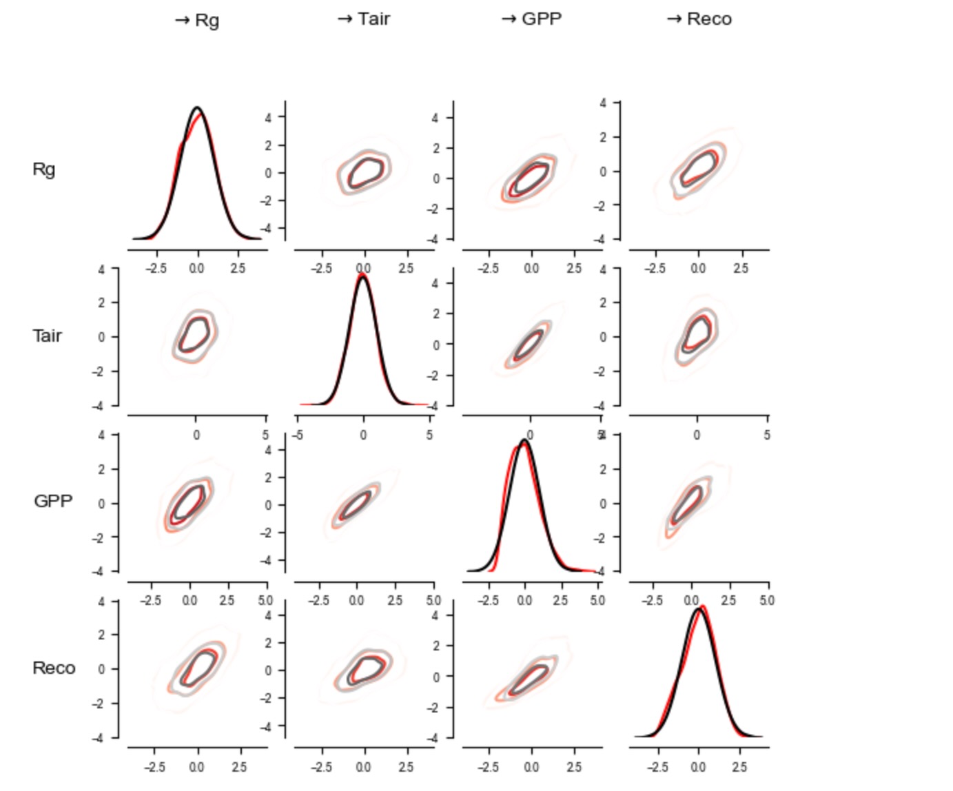
周辺密度は、少し、非正規です。周辺が正規分布になるように、変数を変換することによって、結果の結合密度は、妥当な線形になります。ここには、小さな相違だけがあります。しかし、それにも関わらず条件独立性テストに影響します。したがって、PCMCI+の条件独立性テストは、ここでロバストな部分相関(RobustParCorr)を保証すべきです。それは、部分相関の修正で、最初に周辺を正規分布に変換します。
PCMCIplusのスライディングウィンドウ分析
全てのサイトのデータと6年間の全ては、単一の因果グラフを推定するために、ここで使うことができます。代わりに、もし、因果グラフの非ステーショナリーが示されたならば、スライディングウィンドウ分析が、考慮されるべきです。もっと説明する目的で、スライディングウィンドウ分析が、ここに適用されます。それは、全てのサイトを超えて、二つの連続した6年間のデータを合体することによって、五つの因果グラフを学習します。(こうして5=6-1グラフ、マスキングのためにn=1840から各自推定され)
# Maximum time lag
tau_max = 1

# Conditional independence test
cond_ind_test = RobustParCorr(mask_type='y', verbosity=0)

# Significance level
pc_alpha = 0.05

# Stepsize of sliding window (this can be chosen as desired)
window_step = 365*1

# Length of sliding window (this should strive a balance between enough samples and
# the window-length over which stationarity can be assumed, which, however, is not relevant in our example)
window_length = 365*2

# First set link assumptions to remove parents of Rg
# link_assumptions = None
# See the tutorial on link assumptions in the overview tutorial
link_assumptions_absent_link_means_no_knowledge = {0: {(i, -tau):'' for i in range(N) for tau in range(0, tau_max+1) if not (i==0 and tau==0)}}
link_assumptions =  PCMCI.build_link_assumptions(link_assumptions_absent_link_means_no_knowledge=link_assumptions_absent_link_means_no_knowledge,
                                   n_component_time_series=N,
                                   tau_max=tau_max,
                                   tau_min=0)
for j in link_assumptions:
    print(f"Assumed links of {j}: {link_assumptions[j]}")
Assumed links of 0: {}
Assumed links of 1: {(0, 0): 'o?o', (0, -1): 'o?>', (1, -1): 'o?>', (2, 0): 'o?o', (2, -1): 'o?>', (3, 0): 'o?o', (3, -1): 'o?>'}
Assumed links of 2: {(0, 0): 'o?o', (0, -1): 'o?>', (1, 0): 'o?o', (1, -1): 'o?>', (2, -1): 'o?>', (3, 0): 'o?o', (3, -1): 'o?>'}
Assumed links of 3: {(0, 0): 'o?o', (0, -1): 'o?>', (1, 0): 'o?o', (1, -1): 'o?>', (2, 0): 'o?o', (2, -1): 'o?>', (3, -1): 'o?>'}# Initialize PCMCI class
pcmci = PCMCI(
dataframe=dataframe,
cond_ind_test=cond_ind_test,
verbosity=0)
method_args={'tau_min':0, 'tau_max':tau_max,
'pc_alpha':pc_alpha,
'link_assumptions':link_assumptions,
}
# Run sliding window PCMCIplus
summary_results = pcmci.run_sliding_window_of(method='run_pcmciplus',
method_args=method_args,
window_step=window_step,
window_length=window_length,
conf_lev = 0.9)以下のコードは、時系列の元で、スライディングウィンドウに置かれます。
node_pos = None
            #  {
            # 'y': np.array([0.5, 0., 0.5, 1.]),
            # 'x': np.array([0., 0.5, 1., .5])
            # }

graphs = summary_results['window_results']['graph']
val_matrices = summary_results['window_results']['val_matrix']
n_windows = len(graphs)

mosaic = [['data %s' %j for i in range(n_windows)] for j in range(N)]
mosaic.append(['graph %s' %i for i in range(n_windows)])

fig, axs = plt.subplot_mosaic(mosaic = mosaic,
                              figsize=(6, 5.),  #(6.5, 4.)
                              gridspec_kw={'height_ratios' : [0.6/N for i in range(N)] + [0.4]
                               } ,)

reference = np.where(np.fromiter(dataframe.time_offsets.values(), dtype=int) == 0)[0][0]

for j in range(N):
    ax = axs['data %s' %j]
    trans = mtransforms.blended_transform_factory(ax.transData, ax.transAxes)
    ax.axhline(0., color='black')

    ref_datatime = dataframe.datatime[reference]
    len_ref = len(ref_datatime)

    w = 0
    ax.fill_between(x=ref_datatime, y1=-1, y2=1,
            where=(np.arange(len_ref) >= w*window_step)*(np.arange(len_ref) < w*window_step+window_length), color='grey',
                    alpha=0.3, zorder=-5,
            transform=trans)

    color = 'black'
    for idata in range(dataframe.M):
        data = deepcopy(dataframe.values[idata])
        mask = dataframe.mask[idata].copy()
        datatime = dataframe.datatime[idata].copy()
        # print(data.shape, datatime.shape, T,)

        masked_data = deepcopy(data) #.copy()
        data[mask==1] = np.nan
        masked_data[mask==0] = np.nan
        if j == 0: label = "Site %d" %(idata + 1)
        else: label = None
        ax.plot(datatime, data[:,j], label = label, lw=0.3, alpha=0.6, clip_on=True) #, color=color)
        ax.plot(datatime, masked_data[:,j], color='grey', lw=0.3, alpha=0.2, clip_on=True) #, color=color)

    if j == 0:
        for loc, spine in ax.spines.items():
            if loc not in ['left', 'top']:
                spine.set_color("none")
        ax.xaxis.tick_top()
    else:
        ax.xaxis.set_ticks([])
        for loc, spine in ax.spines.items():
            if loc not in ['left']:
                spine.set_color("none")


    ax.set_ylabel(var_names[j])

    if j == 1: ax.set_ylim(-30, 60)
    if j == 3: ax.set_ylim(None, 30)


for w in range(n_windows):
    if w == 0: show_colorbar=False
    else: show_colorbar = False
    tp.plot_graph(graphs[w],
        # val_matrix=val_matrices[w],
        var_names=var_names,
        show_colorbar=False,  #show_colorbar
        node_label_size=8,
        node_size=0.5,
        arrow_linewidth=3.0,
        link_label_fontsize=5,
        fig_ax=(fig, axs['graph %s' %w]))

fig.subplots_adjust(left=0.12, right=0.97, bottom=0.02, top = 0.93, wspace=0.2, hspace=0.25)
モデルの数式の正解データと比較するとき、個別のスライディングウィンドウグラフにエラーがあります。最初のグラフは、誤った正をもち、他のグラフは、Rg->GPPの間違った方向にリンクを持っています、最後のグラフは、PCMCIplusの衝突リンク方針ルールのせいで、衝突リンクを持っています。そうしたエラーは、有限のサンプルのせいでメソッドの分散を反映しています。しかし、それらは、間違った仮定による結果です。例えば、ここのモデルは、非線形で、しかし、正規周辺変換の後、線形性は良い近似になります。
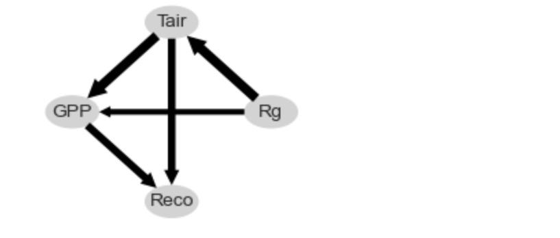
因果グラフの総計
スライディングウィンドウメソッド pcmci.run_sliding_window_ofはまた、五つのスライディングウィンドウグラフを通して、もっとも頻度のあるリンク種別(欠如リンクを含む)からなるグラフの総和を返します。エッジの幅は、リンク種別の頻度を示します。これは、総和グラフが、正解データを承認します。
さらなるオプションは、非パラメトリック独立性テスト、(独立性テストのチュートリアルを参照してください。)しかし、もっと洗練されたパラメトリックモデルとそれらの計算上のサンプルサイズの需要にはトレードオフがあります。最後に、もっと現実的なシナリオは、いくつかの観測されないconfounderがあるかもしれないことです。そのようなケースでは、隠れたconfounderを表す因果探索のメソッドが使用されます。例えば、LPCMCI.そうしたもっと一般的に応用できるアルゴリズムは、しかしながら、一般的に検出力が低くなります。
# Plot aggregated graph ("summary results")
val_tmp = np.abs(summary_results['summary_results']['val_matrix_mean'])
val_tmp[range(len(var_names)), range(len(var_names)), :] = 0.
cross_max = np.abs(val_tmp).max()

graph = summary_results['summary_results']['most_frequent_links']
link_width = summary_results['summary_results']['link_frequency']
fig, ax = tp.plot_graph(
    graph = graph,
    # val_matrix=summary_results['summary_results']['val_matrix_mean'],
    show_colorbar=False,
    link_width=link_width,
    cmap_edges = 'RdBu_r',
    arrow_linewidth=5,
    node_pos = node_pos,
    node_size=0.35,
    node_aspect=1.5,
    var_names=var_names,
    vmin_edges = -1, # -cross_max,
    vmax_edges = 1, # cross_max,
    node_ticks=0.5,
    edge_ticks=1.,
    label_fontsize = 8,
    node_colorbar_label='Auto-RobParCorr',
    link_colorbar_label='Cross-RobParCorr',
    figsize=(2.6, 2.2),
    # network_lower_bound=0.3,
    )
非パラメトリック因果効果推定
2番目の因果の疑問は、合計の因果効果の推定です。(チュートリアル)QADフローチャートによれば、(論文の図2)この推定は、因果時系列グラフの知識を必要とします。上の因果探索時系列グラフを使うことで、ゴールの遅延ゼロの Reco(青)のTair(赤)の因果効果を推定することです。ここで、データの全て(n=1840 x 3サンプル)が使用されます。それは、冬の季節がマスクされるため、(同じ分布から)ステーショナリーになります。
グラフの仮定と調整セット
私たちは、summary_results['summary_results']{'most_frequent_links']を使ってグラフを取得します。しかし、もしこれが、方向のない、衝突するエッジであれば、因果効果分析は、働きません、そして、あなたは、あなた自身でリンクの方向を必要とします。様式は以下のようになります。
original_graph = np.array([[['', ''],
                            ['-->', ''],
                            ['-->', ''],
                            ['', '']],

                           [['<--', ''],
                            ['', '-->'],
                            ['-->', ''],
                            ['-->', '']],

                           [['<--', ''],
                            ['<--', ''],
                            ['', '-->'],
                            ['-->', '']],

                           [['', ''],
                            ['<--', ''],
                            ['<--', ''],
                            ['', '-->']]], dtype='<U3')

# Append lag for nicer plots that include another time lag
added = np.zeros((4, 4, 1), dtype='<U3')
added[:] = ""
original_graph = np.append(original_graph, added , axis=2)

# We will assume different adaptions of this graph, starting with the unchanged version
graph = np.copy(original_graph) 以下は、CausalEffectsクラスを初期化します。
# We are interested in lagged total effect of X on Y
X = [(1, 0)]
Y = [(3, 0)]
causal_effects = CausalEffects(graph, graph_type='stationary_dag',
                    X=X, Y=Y,
                   verbosity=0)
グラフは、隠れたcounfounderを持ちません。しかし、結果は非線形です。それは、最適化した適応メソッドを提案します。最適化した調整セットと中間を含むこのグラフを図示しましょう。
opt = causal_effects.get_optimal_set()
if opt is False: print("NOT IDENTIFIABLE!")
print("X = %s -----> Y = %s" % (str([(var_names[var[0]], var[1]) for var in X]), str([(var_names[var[0]], var[1]) for var in Y])))
print("Oset = ", [(var_names[v[0]], v[1]) for v in opt])
print("Optimality = %s" %str(causal_effects.check_optimality()))
print("Mediators = %s" %str(causal_effects.M))

special_nodes = {}
for node in causal_effects.X:
    special_nodes[node] = 'red'
for node in causal_effects.Y:
    special_nodes[node] = 'blue'
for node in opt:
    special_nodes[node] = 'orange'
for node in causal_effects.M:
    special_nodes[node] = 'lightblue'

link_width = None

fig, ax = tp.plot_time_series_graph(
    # graph = pcmcires['graph'],
    # val_matrix=pcmcires['val_matrix'],
    graph = causal_effects.stationary_graph,
    # graph = causal_effects.graph,
    link_width=link_width,
#     link_attribute=graph_attr,
    cmap_edges = 'RdBu_r',
    arrow_linewidth=3,
    curved_radius=0.4,
    node_size=0.15,
    special_nodes=special_nodes,
    var_names=var_names,
    link_colorbar_label='Cross-strength',
    figsize=(4, 3),
    )
X = [('Tair', 0)] -----> Y = [('Reco', 0)]
Oset = [('GPP', -1), ('Reco', -1), ('Rg', 0)]
Optimality = True
Mediators = {(2, 0)}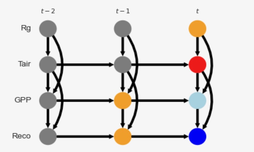
グラフは、X(赤)とY(青)を表示します。中間(淡い青)、調整セットはオレンジです。この適応セットは、XとYの間の全ての非因果パスをブロックします。"最適化"は、最適化調整セットが、全ての調整セットを通るもっとも小さい収束する推定変数を持っているかどうかを参照します。(Runge 2021を参照)
介入の正解データ
観測データから因果の影響を推定する前に、ここでは、私たちは、構造化因果モデルを持つあために、私たちはモデルに実際に介入することによって因果の効果の正解データを生成することができます。これをやりましょう。ここで私たちは、それらは同じ分布を持つため、一つのサイトだけを考えます。
私たちは、dox_valsに異なる介入の数を考えます。そして、各介入の介入データセットを取得します。私たちは、Rgの過去の値は、観測されるべきですが、時間tでのRgのモデルの介入だけが必要です。したがって、私たちは、観測modeldataと介入モデルintervention_dataの両方がモデルに必要です。
dox_vals = np.linspace(-2, 50, 30)

modeldata = np.zeros((T,N))
intervention_data = np.zeros((len(dox_vals), T, N))
random_state = np.random.RandomState(11)
noise = random_state.randn(T, N)
noise[:, 1] += 0.25*random_state.randn(T)**3

for t in range(1, T):

    # Observational data
    modeldata[t,0] = np.abs(280.*np.abs(np.sin((t)*np.pi/365.))**2 + 50.*np.abs(np.sin(t*np.pi/365.))*noise[t,0])
    modeldata[t,1] = 0.8*modeldata[t-1,1] + 0.02*modeldata[t,0] + 5*noise[t,1]
    modeldata[t,2] = np.abs(0.2* modeldata[t-1, 2] + 0.002*modeldata[t,0] * modeldata[t,1] + 3*noise[t,2])
    modeldata[t,3] = np.abs(0.3*modeldata[t-1,3] + 0.9*modeldata[t,2] * 0.8**(0.12*(modeldata[t,1]-15)) + 2*noise[t,3])

    # Interventional data where Tair is intervened
    # and this intervention propagates along the mediator GPP and then affects Reco,
    # while variables not on causal paths are taken from the observational data
    for i, val in enumerate(dox_vals):
        intervention_data[i,t,0] = modeldata[t,0] # stays the same   #np.abs(280.*np.abs(np.sin((t)*np.pi/365.))**2 + 50.*np.abs(np.sin(t*np.pi/365.))*noise[t,0])
        intervention_data[i,t,1] = val # Intervened variable at time t    #0.8*modeldata[t-1,1] + 0.02*modeldata[t,0] + 5*noise[t,1]
        intervention_data[i,t,2] = np.abs(0.2* modeldata[t-1, 2] + 0.002*modeldata[t,0] * intervention_data[i,t,1] + 3*noise[t,2])
        intervention_data[i,t,3] = np.abs(0.3*modeldata[t-1,3] + 0.9*intervention_data[i,t,2] * 0.8**(0.12*(intervention_data[i,t,1]-15)) + 2*noise[t,3])
パラメトリックモデルの仮定と、因果効果の推定
因果推定の紹介のために、私たちは、レビュー論文とチュートリアル(ハイパーリンク)を参照します。非線形調整は、以下で与えられます。

統計または、機械学習モデルの選択が必要です。ここで、二つのアプローチを比較します。最初に、線形回帰skleanのLinearRegression(ハイパーリンク)の共変量適応と、2番目にマルチレイヤーパーセプトロンsklearnのMLPRegressorによる共変量適応(赤で色付けたMLP)これは、フィードフォワードニューラルネットワークとして知られています。
グラフXとY、介入の値 dox_vals, ブートストラップ信頼区間推定、関数の図示、の初期化を含む推定そ包みましょう。
def fit_predict_plot(X, Y, graph, dataframe, estimator, dox_vals,
                     data_transform=None, graph_type='stationary_dag', adjustment_set='optimal',
                     confidence=False,
                     boot_samples=100,
                     seed=None,
                     fig_ax=None,
                     label=None,
                     figsize=(4, 3),
                     verbosity=0):

    causal_effects = CausalEffects(graph,
                        graph_type='stationary_dag',
                        X=X, Y=Y,
                       verbosity=verbosity)
    causal_effects.fit_total_effect(
        dataframe=dataframe,
        mask_type='y',
        estimator=estimator,
        adjustment_set = adjustment_set,
        ignore_identifiability=True,
#         conditional_estimator=conditional_estimator,
        data_transform=data_transform
        )

    # Fit causal effect model from observational data
    if confidence:
        causal_effects.fit_bootstrap_of(
            method='fit_total_effect',
            method_args={'dataframe':dataframe,
            'mask_type':'y',
            'estimator':estimator,
            'adjustment_set':adjustment_set,
            'ignore_identifiability':True,
#             'conditional_estimator':conditional_estimator,
            'data_transform':data_transform,
            },
            boot_samples=boot_samples,
            seed=seed,
            )


    # Predict effect of interventions do(X=0.), ..., do(X=1.) in one go
    intervention_values = np.repeat(dox_vals.reshape(len(dox_vals), 1), axis=1, repeats=len(X))
    estimated_causal_effects = causal_effects.predict_total_effect(
            intervention_data=intervention_values,
            transform_interventions_and_prediction=True,
#             conditions_data=conditions_data
    )

    # # Predict effect of interventions do(X=0.), ..., do(X=1.) in one go
    if confidence:
        estimated_confidence_intervals = causal_effects.predict_bootstrap_of(
            method='predict_total_effect',
            method_args={'intervention_data':intervention_values,
                        'transform_interventions_and_prediction':True,
#                          'conditions_data':conditions_data
                        })

    if fig_ax is None:
        fig = plt.figure(figsize=figsize)
        ax = fig.add_subplot(111)
    else:
        fig, ax = fig_ax

    if confidence:
        ax.errorbar(intervention_values[:,0], estimated_causal_effects[:,0],
                 np.abs(estimated_confidence_intervals - estimated_causal_effects[:,0]),
                 alpha=1,
                 label=label,
                   )
    else:
        ax.plot(intervention_values[:,0], estimated_causal_effects[:,0],
            alpha=1,
            label=label,
               )
    # ax.set_ylim(-0.25, 0.35)
    ax.grid(lw=0.5)
    ax.set_xlabel(r'Intervention value in $X$')
    ax.set_ylabel(r'Estimated effect on $Y$')
#     ax.legend(loc='best', fontsize=6)
以下の図は、正解データを上書きします。推定した因果効果の線形性、と非線形の推定は、
fig = plt.figure(figsize=(4, 3))
ax = fig.add_subplot(111)
fig_ax = (fig, ax)

X = [(1, 0)]
Y = [(3, 0)]

# Ground truth
ax.plot(dox_vals, intervention_data[:, mask_dict[0][:,Y[0][0]]==False, Y[0][0]].mean(axis=1),
    alpha=0.8,
    color = 'black',
    linestyle='solid',
    label="Truth")

# Estimation using LinearRegression
fit_predict_plot(X=X, Y=Y, graph=graph, dataframe=dataframe,
                 estimator=LinearRegression(),
                 dox_vals=dox_vals,
                 data_transform=None,
                 graph_type='stationary_dag',
                 adjustment_set='optimal',
                 confidence=False,
                 seed=4,
                 label='LinReg',
                 fig_ax = fig_ax,
                 verbosity=0)

# Estimation using MLPRegressor
fit_predict_plot(X=X, Y=Y, graph=graph, dataframe=dataframe,
                 estimator=MLPRegressor(random_state=2, max_iter=1000),
                 dox_vals=dox_vals,
                 data_transform=None,
                 graph_type='stationary_dag',
                 adjustment_set='optimal',
                 confidence=False,
                 seed=4,
                 label='MLP',
                 fig_ax = fig_ax,
                 verbosity=0)

ax.legend(loc='best', fontsize=10)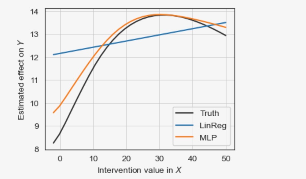
MLPはより良い非線形の結果を推定しますが、線形回帰は失敗します。
それは、信頼区間を推定することが賢明です。これは、ここでブートストラップを基礎に実装されています。以下のセルはそれを取り扱います。
fig = plt.figure(figsize=(4, 3))
ax = fig.add_subplot(111)
fig_ax = (fig, ax)

X = [(1, 0)]
Y = [(3, 0)]

# Ground truth
ax.plot(dox_vals, intervention_data[:, mask_dict[0][:,Y[0][0]]==False, Y[0][0]].mean(axis=1),
    alpha=0.8,
    color = 'black',
    linestyle='solid',
    label="Truth")

# Estimation using LinearRegression
fit_predict_plot(X=X, Y=Y, graph=graph, dataframe=dataframe,
                 estimator=LinearRegression(),
                 dox_vals=dox_vals,
                 data_transform=None,
                 graph_type='stationary_dag',
                 adjustment_set='optimal',
                 confidence=True,
                 boot_samples=50,
                 seed=4,
                 label='LinReg',
                 fig_ax = fig_ax,
                 verbosity=0)

# Estimation using MLPRegressor
fit_predict_plot(X=X, Y=Y, graph=graph, dataframe=dataframe,
                 estimator=MLPRegressor(random_state=2, max_iter=1000),
                 dox_vals=dox_vals,
                 data_transform=None,
                 graph_type='stationary_dag',
                 adjustment_set='optimal',
                 confidence=True,
                 boot_samples=50,
                 seed=4,
                 label='MLP',
                 fig_ax = fig_ax,
                 verbosity=0)

# Also show observational density of Tair
ax2 = ax.twinx()
x = dataframe.values[0][:, X[0][0]][dataframe.mask[0][:, X[0][0]]==False]
density = gaussian_kde(x[np.isnan(x)==False])
ax2.fill_between(dox_vals,
    y1=np.zeros(len(dox_vals)), y2=density(dox_vals),
    color='grey', alpha=0.5, label=r"$p(%s)$" %var_names[X[0][0]])
ax2.get_yaxis().set_ticklabels([])
ax2.get_yaxis().set_ticks([])
ax2.set_ylim(0, density(dox_vals).max()*4)
ax.legend(loc='best', fontsize=10)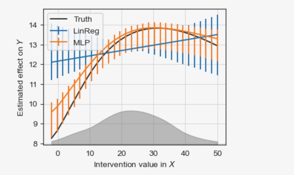
左と右下のもっと大きい(ブートストラップ)信頼区間は、小さなトレーニングデータ(密度はグレイで示されます)の領域の推定がさらに悪化することを説明します。サイドノートとして:グラフは、結果が推定されたので、同じデータから因果探索を経由して推定されました。そして、したがって、信頼区間は、非常に小さくなります。(論文の事後選択推論のコメントを参照してください)。妥協により、(マスキングによって)サンプルを分割します。
グラフに関する代替的な仮定を使った推定
代替グラフは、GPPtとRecotの間で表されるのと同じように、Tairt-1とRecotの間に隠れたconfoundingを仮定することができます。この隠れたconfoundingは、二方向のエッジ、Tairt-1 <-> Recotと GPPt <-> Recotによってグラフィカルに表現されます。そして、他の大気と水蒸気のドライバーから現れることができます。この修正した隠れ変数グラフ(graph_type='stationary_admg')の因果の影響は、識別することができます。しかし、最適化調整セットは、変更されます。
graph = np.copy(original_graph)

# Add confounding links, '+->' indicates the existence of both a causal effect `-->` and confounding `<->`
graph[2,3,0] = '+->' ; graph[3,2,0] = '<-+'
graph[1,3,1] = '<->'
# We are interested in lagged total effect of X on Y
X = [(1, 0)]
Y = [(3, 0)]
causal_effects = CausalEffects(graph, graph_type='stationary_admg',
X=X, Y=Y,
verbosity=0)opt = causal_effects.get_optimal_set()
if opt is False: print("NOT IDENTIFIABLE!")
print("X = %s -----> Y = %s" % (str([(var_names[var[0]], var[1]) for var in X]), str([(var_names[var[0]], var[1]) for var in Y])))
print("Oset = ", [(var_names[v[0]], v[1]) for v in opt])
print("Optimality = %s" %str(causal_effects.check_optimality()))
print("Mediators = %s" %str(causal_effects.M))
special_nodes = {}
for node in causal_effects.X:
special_nodes[node] = 'red'
for node in causal_effects.Y:
special_nodes[node] = 'blue'
for node in opt:
special_nodes[node] = 'orange'
for node in causal_effects.M:
special_nodes[node] = 'lightblue'
link_width = None
fig, ax = tp.plot_time_series_graph(
# graph = pcmcires['graph'],
# val_matrix=pcmcires['val_matrix'],
graph = causal_effects.stationary_graph,
# graph = causal_effects.graph,
link_width=link_width,
# link_attribute=graph_attr,
cmap_edges = 'RdBu_r',
arrow_linewidth=3,
curved_radius=0.4,
node_size=0.15,
special_nodes=special_nodes,
var_names=var_names,
link_colorbar_label='Cross-strength',
figsize=(4, 3),
)X = [('Tair', 0)] -----> Y = [('Reco', 0)]
Oset = [('GPP', -1), ('Reco', -1), ('Rg', 0), ('Tair', -1), ('Rg', -1), ('Tair', -2)]
Optimality = True
Mediators = {(2, 0)}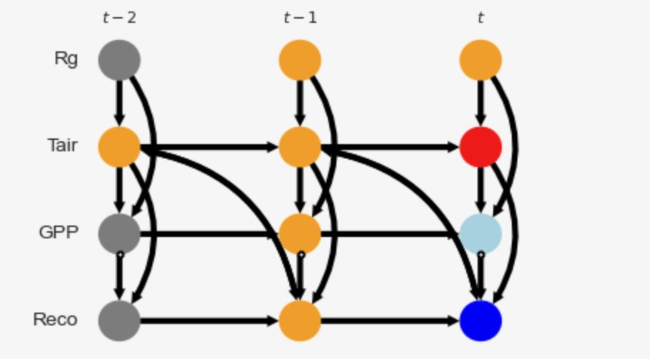
まだ因果の影響は、MLP(線形回帰でなく)と同様です。
fig = plt.figure(figsize=(4, 3))
ax = fig.add_subplot(111)
fig_ax = (fig, ax)

X = [(1, 0)]
Y = [(3, 0)]

# Ground truth
ax.plot(dox_vals, intervention_data[:, mask_dict[0][:,Y[0][0]]==False, Y[0][0]].mean(axis=1),
    alpha=0.8,
    color = 'black',
    linestyle='solid',
    label="Truth")

# Estimation using LinearRegression
fit_predict_plot(X=X, Y=Y, graph=graph, dataframe=dataframe,
                 estimator=LinearRegression(),
                 dox_vals=dox_vals,
                 data_transform=None,
                 graph_type='stationary_admg',
                 adjustment_set='optimal',
                 confidence=True,
                 boot_samples=50,
                 seed=4,
                 label='LinReg',
                 fig_ax = fig_ax,
                 verbosity=0)

# Estimation using MLPRegressor
fit_predict_plot(X=X, Y=Y, graph=graph, dataframe=dataframe,
                 estimator=MLPRegressor(random_state=2, max_iter=1000),
                 dox_vals=dox_vals,
                 data_transform=None,
                 graph_type='stationary_admg',
                 adjustment_set='optimal',
                 confidence=True,
                 boot_samples=50,
                 seed=4,
                 label='MLP',
                 fig_ax = fig_ax,
                 verbosity=0)
ax.legend(loc='best', fontsize=10)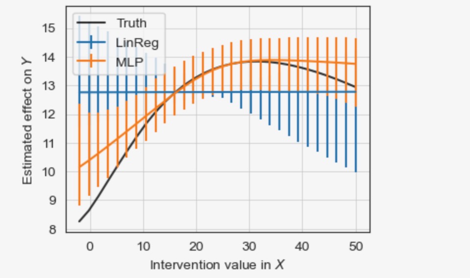
この分析は、代替的な仮定のセットの下での結果を議論し、評価することで、もっとロバストな結果を可能にする仮定を置くことに関して、もっと明白に、透過的にするための重要性を示します。
非因果推定
最後に、共変量なし('-uni')と、共変量として他の全ての変数とともに('-all')、非因果モデルを取得するための結果を参照しましょう。
fig = plt.figure(figsize=(4, 3))
ax = fig.add_subplot(111)
fig_ax = (fig, ax)

X = [(1, 0)]
Y = [(3, 0)]

all_conds = [(i, -tau) for i in range(N) for tau in range(0, graph.shape[2]) if (i, -tau) not in X and  (i, -tau) not in Y]

# Ground truth
ax.plot(dox_vals, intervention_data[:, mask_dict[0][:,Y[0][0]]==False, Y[0][0]].mean(axis=1),
    alpha=0.8,
    color = 'black',
    linestyle='solid',
    label="Truth")

# Estimation without adjustment (nonlinear correlation)
fit_predict_plot(X=X, Y=Y, graph=graph, dataframe=dataframe,
                 estimator=MLPRegressor(random_state=2, max_iter=1000),
                 dox_vals=dox_vals,
                 data_transform=None,
                 graph_type='stationary_admg',
                 adjustment_set=[],
                 confidence=False,
                 boot_samples=50,
                 seed=4,
                 label='MLP-uni',
                 fig_ax = fig_ax,
                 verbosity=0)

# Estimation with all other variables
fit_predict_plot(X=X, Y=Y, graph=graph, dataframe=dataframe,
                 estimator=MLPRegressor(random_state=2, max_iter=1000),
                 dox_vals=dox_vals,
                 data_transform=None,
                 graph_type='stationary_admg',
                 adjustment_set=all_conds,
                 confidence=False,
                 boot_samples=50,
                 seed=4,
                 label='MLP-all',
                 fig_ax = fig_ax,
                 verbosity=0)
ax.legend(loc='best', fontsize=10)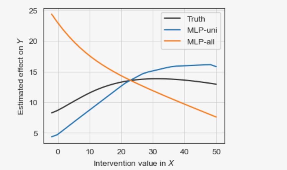
'-uni'アプローチは、confoundingの影響を受けます、'-all'アプローチは、中間のGPPtをブロックします。両者はバイアスのある推定を導きます。
tigramiteの機能と様々なメソッドは、他のチュートリアルを見てください。
のメソッド選択フローチャートに従い )